- Today
- Holidays
- Birthdays
- Reminders
- Cities
- Atlanta
- Austin
- Baltimore
- Berwyn
- Beverly Hills
- Birmingham
- Boston
- Brooklyn
- Buffalo
- Charlotte
- Chicago
- Cincinnati
- Cleveland
- Columbus
- Dallas
- Denver
- Detroit
- Fort Worth
- Houston
- Indianapolis
- Knoxville
- Las Vegas
- Los Angeles
- Louisville
- Madison
- Memphis
- Miami
- Milwaukee
- Minneapolis
- Nashville
- New Orleans
- New York
- Omaha
- Orlando
- Philadelphia
- Phoenix
- Pittsburgh
- Portland
- Raleigh
- Richmond
- Rutherford
- Sacramento
- Salt Lake City
- San Antonio
- San Diego
- San Francisco
- San Jose
- Seattle
- Tampa
- Tucson
- Washington
Mauldin Today
By the People, for the People
Mauldin Unveils New City Brand: A Fusion of Stability and Innovation
The city's updated visual identity aims to reflect its history and future growth.
Apr. 12, 2026 at 8:33pm
Got story updates? Submit your updates here. ›
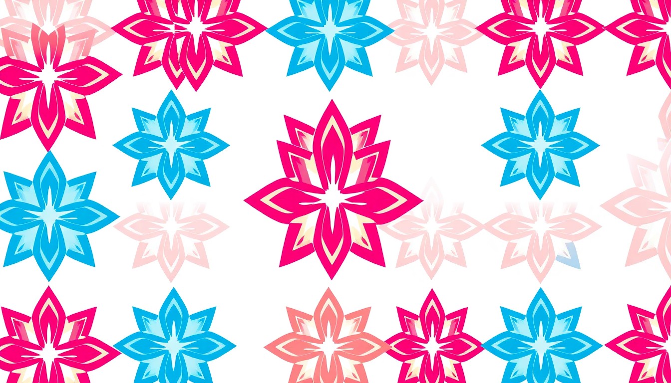 Mauldin's new city logo, a bold visual symbol of the community's fusion of stability and innovation, will be prominently featured across the city's branding and communications.Mauldin Today
The City of Mauldin has launched a modernized city logo and branding strategy designed to represent the community's dual identity as both firmly rooted in its history and aggressively forward-thinking. The new visual identity features a geometric, star-like emblem in a bold two-color palette of blue and magenta-red, symbolizing the city's stability and innovation.
Why it matters
As Mauldin continues to undergo significant transformation, particularly with the expansion of BridgeWay Station and revitalization of the City Center, the updated branding provides a cohesive 'face' for the city as it competes for investment and tourism on a regional stage.
The details
The new logo replaces older iterations with a cleaner, more versatile design that can be displayed in full color, all-black, or all-white. The interlocking nature of the icon suggests a sense of community connection and the coming together of different sectors. The choice of colors was intentional, with blue representing trust, dependability, and calmness, and magenta-red symbolizing passion, creativity, and unconventionality.
- The new city branding was unveiled this week.
- The gradual rollout of the new logo on physical assets, such as city signage and staff uniforms, is expected to follow over the coming months.
The players
City of Mauldin
The local government of Mauldin, South Carolina, which is responsible for the new city branding initiative.
BridgeWay Station
A major development project currently underway in Mauldin that is part of the city's ongoing transformation.
What’s next
Residents can expect to see the new logo appear across city platforms immediately, including official social media channels, the city website, and digital communications.
The takeaway
Mauldin's updated branding reflects the city's commitment to maintaining its dependable character while embracing innovation and progress, positioning it to compete for investment and tourism as it continues to evolve.